
Place 2 Place

Place 2 Place already had an established booking app, but its website no longer reflected the way the business operated or how easy it was for customers to book.

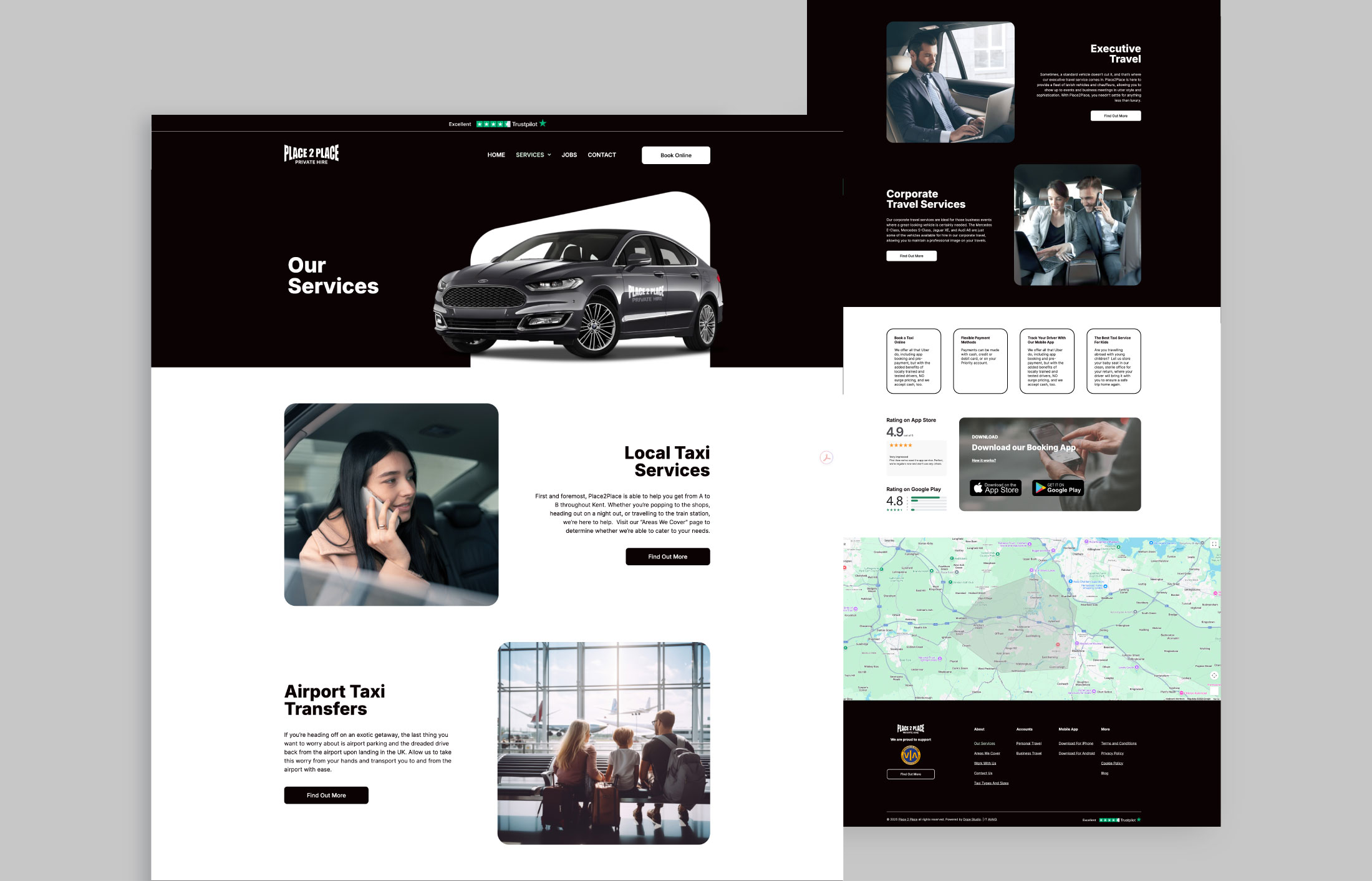
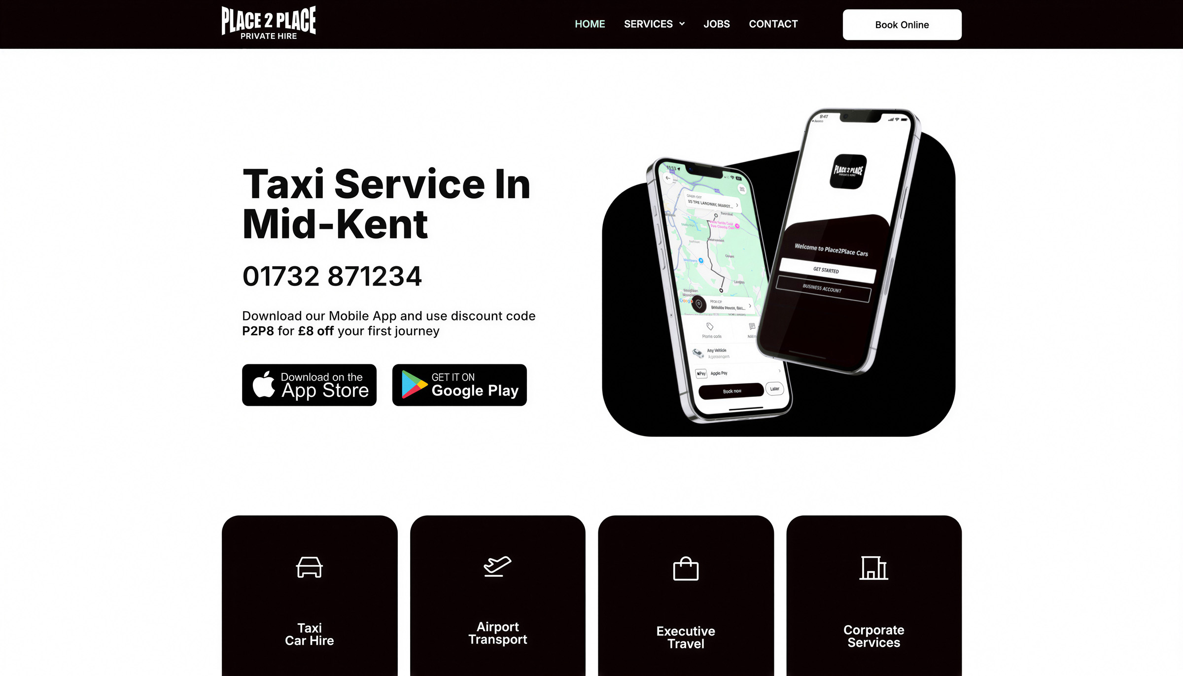
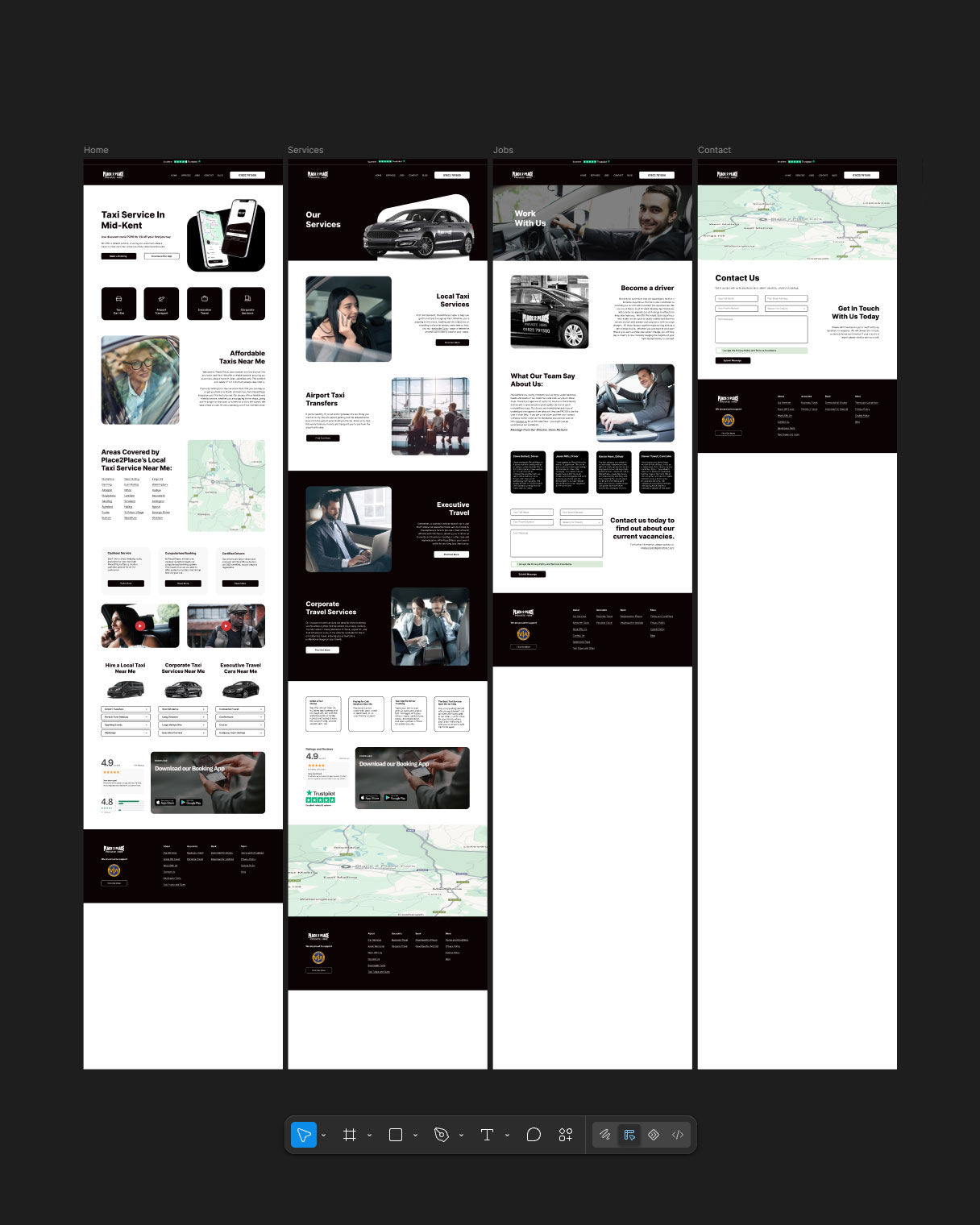
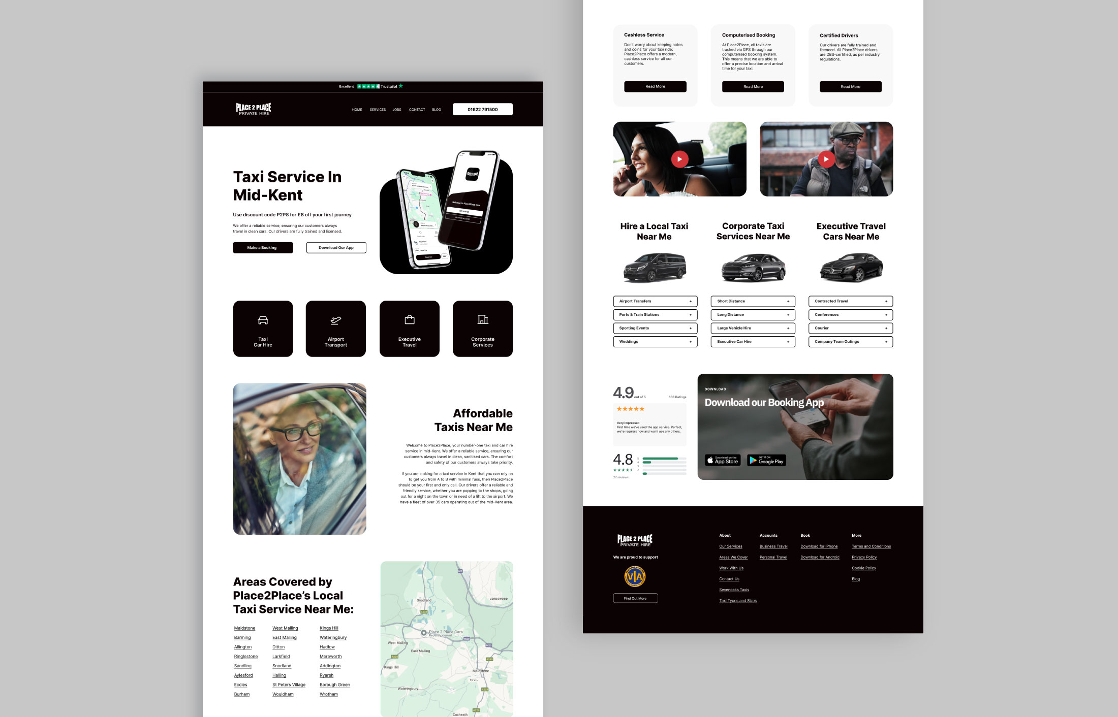
We redesigned the website around a much simpler customer journey, keeping the existing Place 2 Place identity while bringing the look and feel closer to the mobile app. Online booking and app downloads were given much greater prominence, backed up by clear routes into local taxi hire, airport transfers, corporate travel, executive travel and larger vehicle options.

Task

Redesign an established private hire website around easier booking, stronger mobile app promotion and simpler navigation.
  • Strategy

    UX Strategy, Content Structure, Conversion Planning

  • Design

    UI/UX Design, Art Direction, Responsive Design

  • Client

    Place 2 Place

  • Location

    Aylesford, UK

Challenge

Make booking the easiest part of the website.

Place 2 Place did not need a new identity. The logo was already established and the business had an existing mobile app that customers could use to book, pay and track their journeys. The problem was that the older website felt disconnected from that experience.

The redesign started with the journey customers actually needed to make. Booking online and downloading the app had to be immediately accessible, while the wider website still needed to explain a substantial range of services covering everyday taxi journeys, airport transfers, executive and corporate travel, and vehicles ranging up to larger group transport.

Redesign

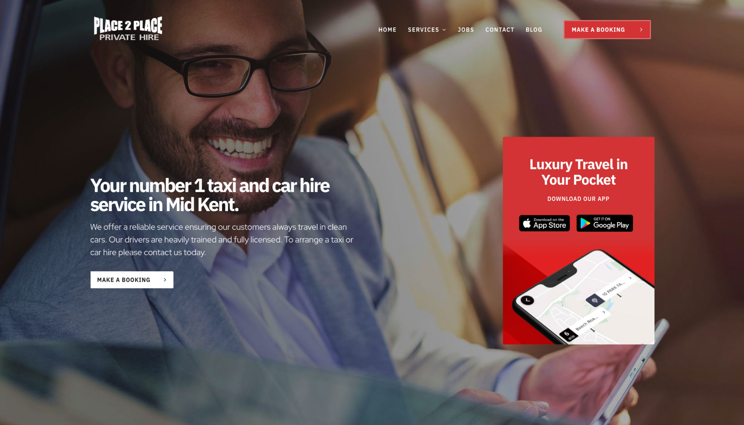
Before & After

Rather than changing the existing Place 2 Place brand, we concentrated on modernising how it was presented.

The new website uses a cleaner, more minimal layout with straightforward navigation, prominent booking routes and repeated access to the mobile app. The visual direction was developed to feel more consistent with the app, creating a better connection between the website and the digital service customers were already being encouraged to use.

The result is a site that feels much more focused on completing a journey rather than making visitors work through unnecessary pages before they can book.

Before After
Responsive design

Designed around
booking on the move.

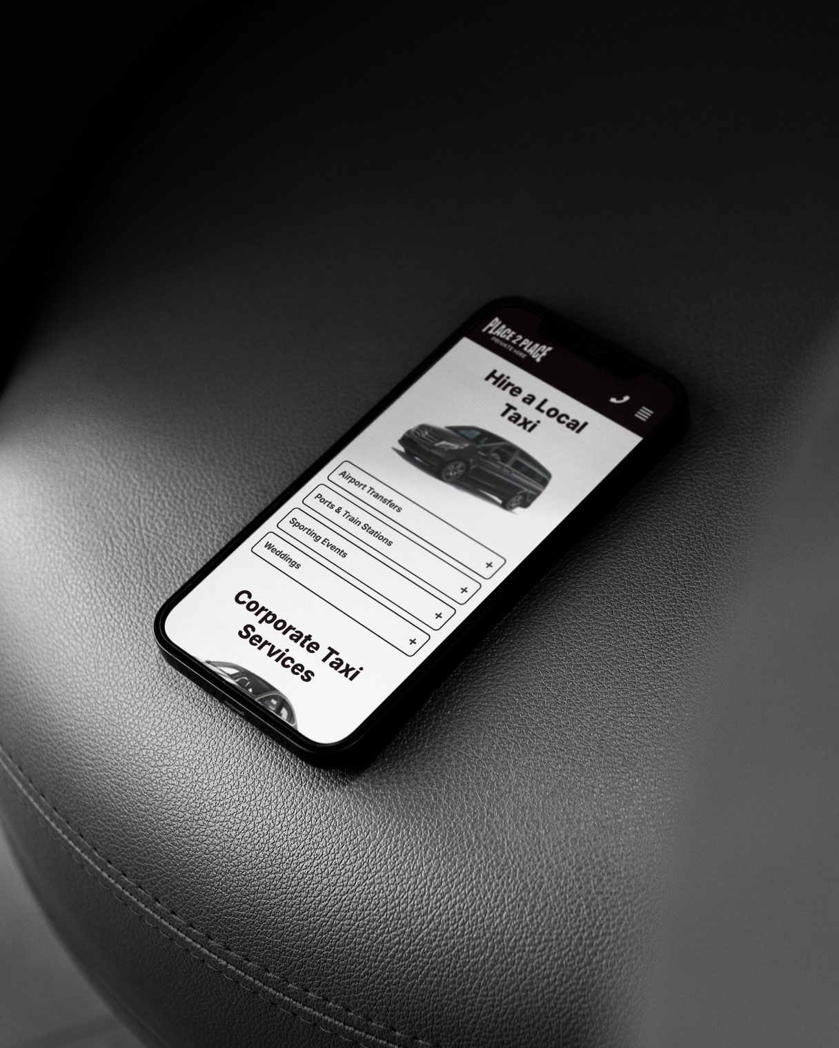
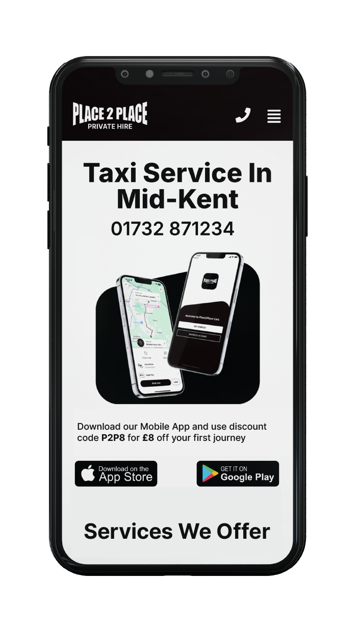
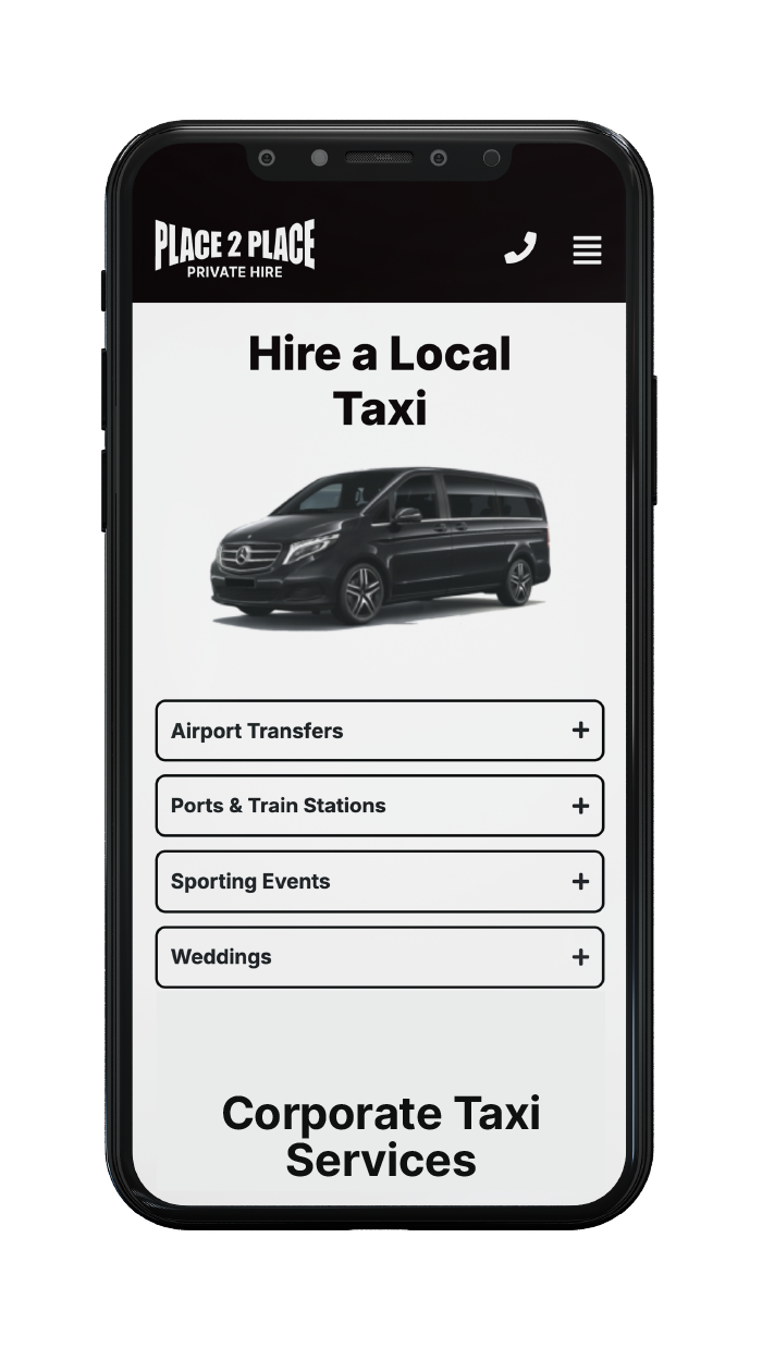
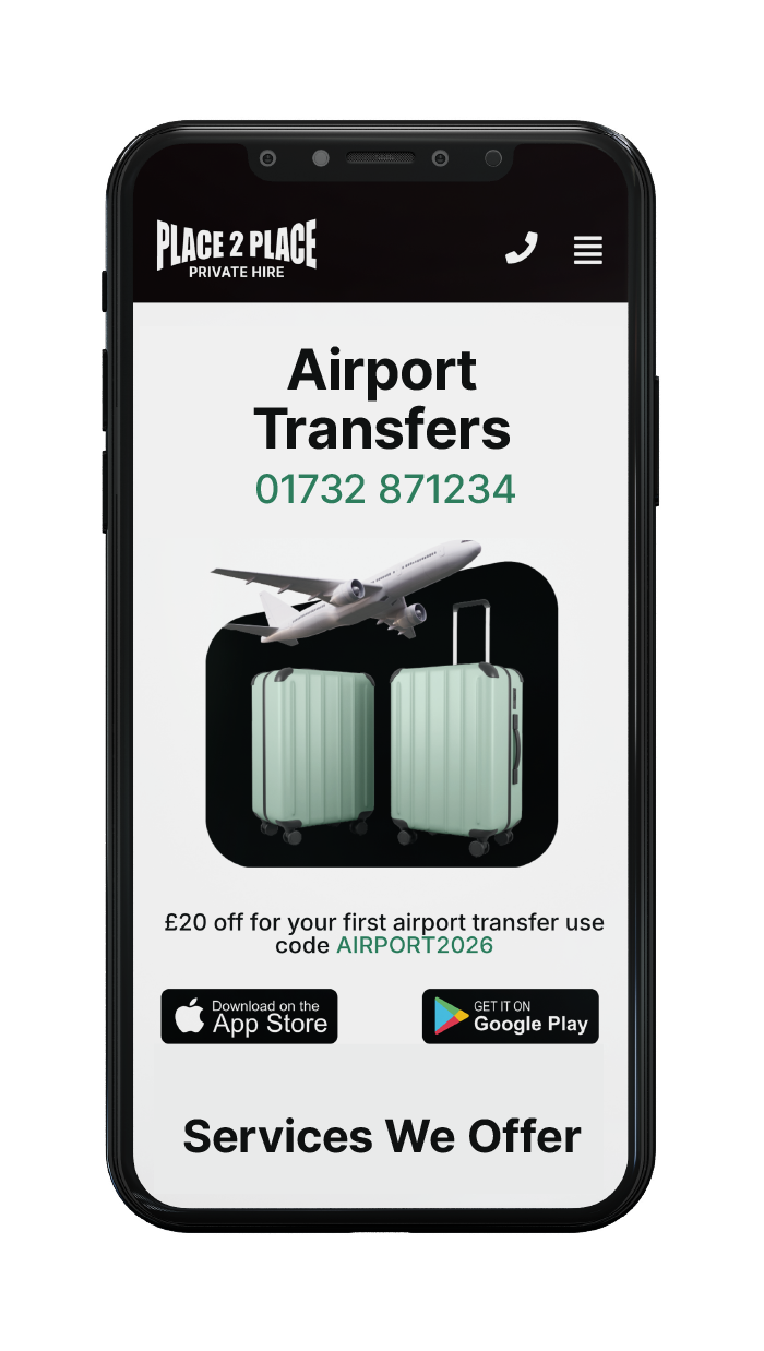
The mobile version was particularly important because the website and app form part of the same customer journey.

Navigation was kept simple, calls to action remain easy to reach and customers can quickly move from finding the service they need to booking online or downloading the app without navigating through an overly complicated website.

0

Hours of video

0

Websites built

What we used

Technologies used
for this project.

word press

Word Press Content Management System

figma logo

Figma Design and Prototyping Platform

google

Search Engine Optimisation

LET’S TALK

Need something dope?

Start the ball rolling and get in touch, let’s turn your vision into reality!

Back
Preloader image