Typography is often treated as the finishing touch, something to choose once the logo, colours, and visuals are in place. In reality, type plays a much bigger role. It shapes how a brand sounds before a single word is fully read.
When people think about branding, they usually picture a logo and a colour palette. Those things matter, but typography quietly does a lot of the heavy lifting. The typeface you choose, the way headings are styled, and the spacing between lines all influence how people understand your business.
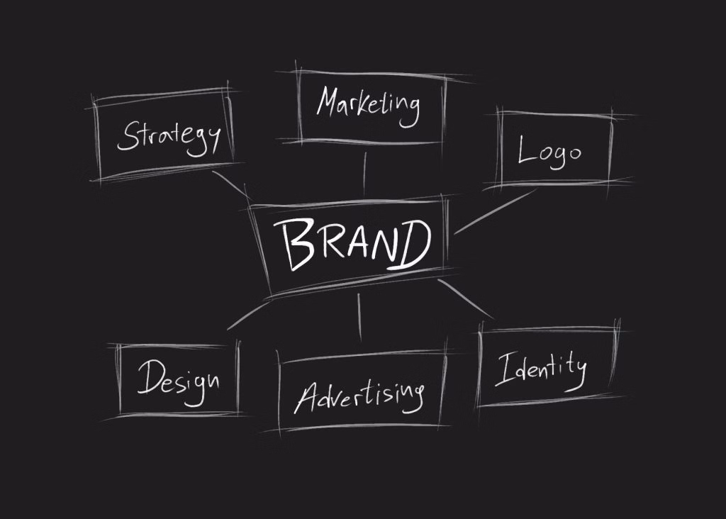
This post explains why typography matters in branding, what it changes commercially, and the mistakes that make otherwise good brands feel inconsistent.
Quick Answer
Typography matters in branding because it shapes how your business is perceived and how easy it is to recognise and trust. A clear type system improves readability, builds consistency across touchpoints, supports accessibility, and helps your messaging land with more confidence.
Typography gives your brand a voice
Every brand has a tone, even if it has never been defined properly. Typography is one of the clearest ways that tone shows up. A sharp condensed typeface can feel direct and confident. A rounded typeface can feel more approachable. A serif can suggest heritage and authority. A clean sans serif can feel modern and practical.
This does not mean every business needs a dramatic font choice. Many strong brands use simple typography. What matters is alignment. A luxury brand, a children’s activity company, a law firm, and a cleaning app should not all “sound” the same visually.
If your typography feels mismatched to your market, the brand feels confused even if the copy is strong.
It helps people recognise you quickly
Brand recognition is built through repetition. When the same logo, colours, imagery style, and typography appear again and again, people begin to connect them with the business. Typography is a major part of that system, because it is present on almost every touchpoint.
If your website uses one style, your social content uses another, and your proposals use something different again, the brand starts to feel fragmented. It becomes harder to recognise, and harder to remember.
Consistent typography creates a visual thread. It makes a social graphic feel connected to a web page. It makes a proposal feel connected to an advert. Over time, that consistency helps the business feel more established.
Typography builds trust and credibility
People make quick judgements. A page that is difficult to read, uses too many fonts, or feels visually inconsistent can create doubt, even when the service is good. Poor typography can make a brand feel rushed, cheap, or careless.
Strong typography has the opposite effect. It suggests attention to detail. It makes the experience feel considered. Those small signals add up, because trust is often built through many little decisions, not one big claim.
In practice, clear headings, readable body text, sensible spacing, and a consistent hierarchy can make the same message feel more credible without changing the copy at all.
It makes your content easier to read
Branding is not only about looking distinctive. It also needs to work. If people cannot read your content comfortably, the design has failed, no matter how nice the mock-up looks.
Good typography guides the eye through a page and helps people understand what matters first. Headings, subheadings, body text, captions, and calls to action need a clear relationship with one another.
This is especially important online, where people scan before they commit to reading. A strong typographic structure lets someone understand the shape of a page in seconds, then decide whether to go deeper.
Typography affects accessibility more than most brands realise
Typography choices directly affect accessibility. Font size, line height, contrast, spacing, and weight all influence how easy text is to read. If type is too small on mobile, too light against the background, or crammed into tight blocks, it frustrates people quickly.
Accessible typography does not mean boring typography. It means making decisions that respect the reader in real conditions, on phones, in bright daylight, by tired eyes, and by people with different visual needs.
If you want your brand to feel modern and professional, accessibility is part of that standard.
It supports the rest of your visual identity
Typography should not be treated separately from colour, layout, photography, illustration, and motion. When those elements are aligned, the brand feels coherent. When they fight each other, the identity becomes harder to understand.
A relaxed, warm brand can feel strange if paired with harsh, technical typography. A precise engineering brand can lose authority if the type system feels too playful. The right typography choice helps the rest of the identity make sense.
This is why typography is not a “last step”. It is a core part of the brand system.
Common typography mistakes that weaken branding
The most common mistake is using too many fonts. A brand does not need a different typeface for every situation. A small, controlled set is usually stronger and easier to manage.
Another mistake is choosing a typeface because it looks interesting in isolation, without testing it across headings, longer paragraphs, mobile screens, and real brand materials. A font that only looks good in one perfect mock-up is not enough for a real identity.
Spacing is often overlooked too. Even a good typeface can feel awkward if the line height is tight, margins are cramped, or hierarchy is unclear. Typography is not just the font file, it is the system around how text is arranged and scaled.
How Dope Studio Can Help
Typography is one of the fastest ways to make a brand feel more consistent and more credible, but only when it is treated as a system rather than a one-off choice. At Dope Studio, we build type systems that work across real touchpoints, website, social, proposals, pitch decks, and day-to-day marketing, so the brand stays recognisable and easy to apply.
We define hierarchy, spacing, and usage rules so your team is not improvising. That usually improves readability, strengthens the perceived quality of the brand, and makes content easier to produce without losing consistency.
To learn more, explore our branding and visual identity services here: Branding & Visual Identity
The Bottom Line
Typography matters because it shapes recognition, trust, readability, and personality. It gives your brand a visual voice and influences how people feel about your business before they have fully processed the message.
If your brand feels inconsistent, harder to recognise than it should, or less premium than the service you deliver, typography is one of the best places to start. A clearer type system can make every piece of communication feel more joined up, from your website to your sales material.
The strongest brands treat typography as part of the identity foundation, not a finishing touch.
FAQ
How many fonts should a brand use?
In most cases, fewer is better. A small controlled set is easier to apply consistently and usually looks more considered. The priority is a clear hierarchy, not a big collection of typefaces.
Does typography really affect trust?
Yes. Readability, spacing, and consistency send quick signals about quality and attention to detail. When typography feels messy or hard to read, it can create doubt even if the service is strong.
What is a typography system in branding?
It is the set of rules that defines which fonts are used, how headings and body text behave, and how spacing and hierarchy are applied across different formats. It turns typography into something repeatable rather than improvised.
Should my website typography match my print typography?
It should feel like the same brand. That does not always mean identical font files, but the hierarchy and overall typographic style should be consistent so touchpoints feel connected.
What is the biggest typography mistake businesses make?
Using too many fonts and not testing them in real situations. A typeface that looks good in isolation can fail on mobile, in longer copy, or alongside your colour palette if it is not chosen and structured properly.