The Electrical Academy
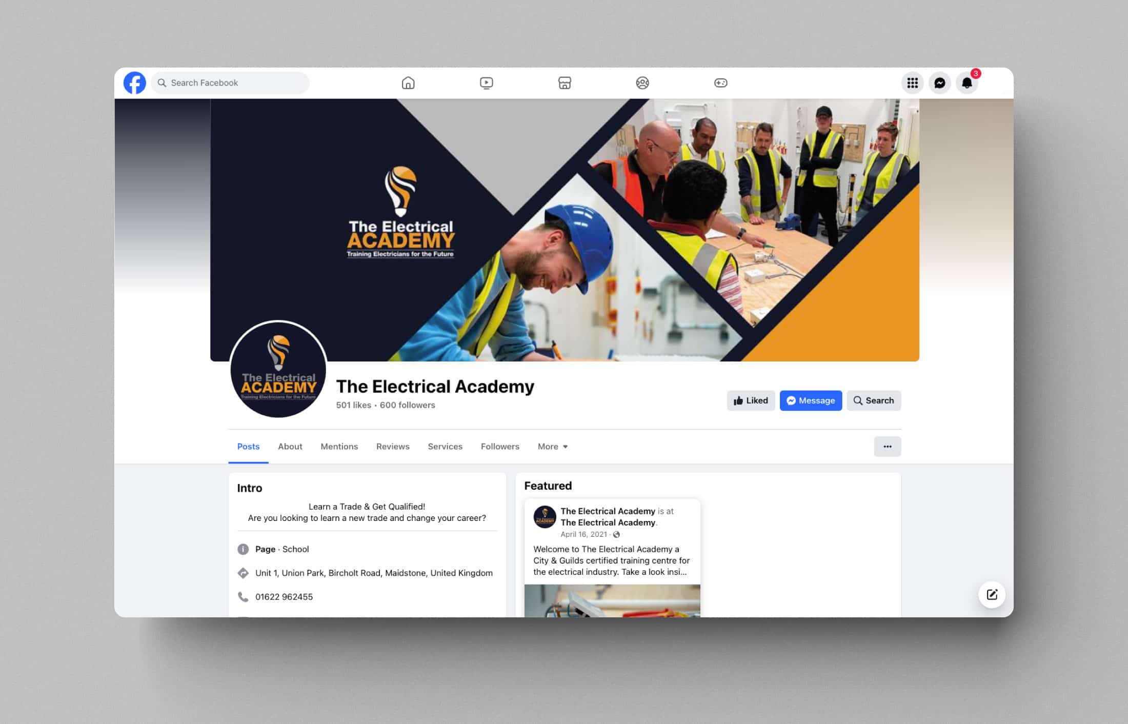
Dope Studio had the honour of partnering with The Electrical Academy, a distinguished education provider in the electrical industry. Understanding the diverse nature of marketing platforms, our designs were versatile and adaptable. Whether viewed on a website, social media, or in print, The Electrical Academy’s visual identity remained intact. This adaptability ensures a seamless and unified brand experience for audiences across different channels.
Task
Web development & SEO services to reflect the standard of service and the quality of products they offer.
Strategy
Brand Strategy, UX Strategy
Design
UI/UX Design, Art Direction
Client
The Electrical Academy
Challenge
Enhanced user experience with an online course booking system.
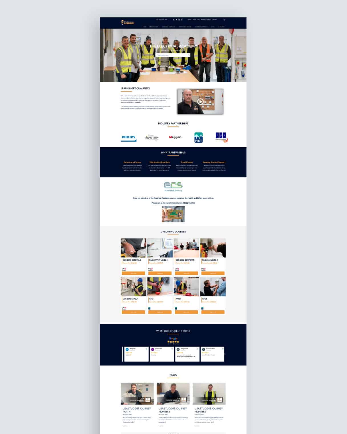
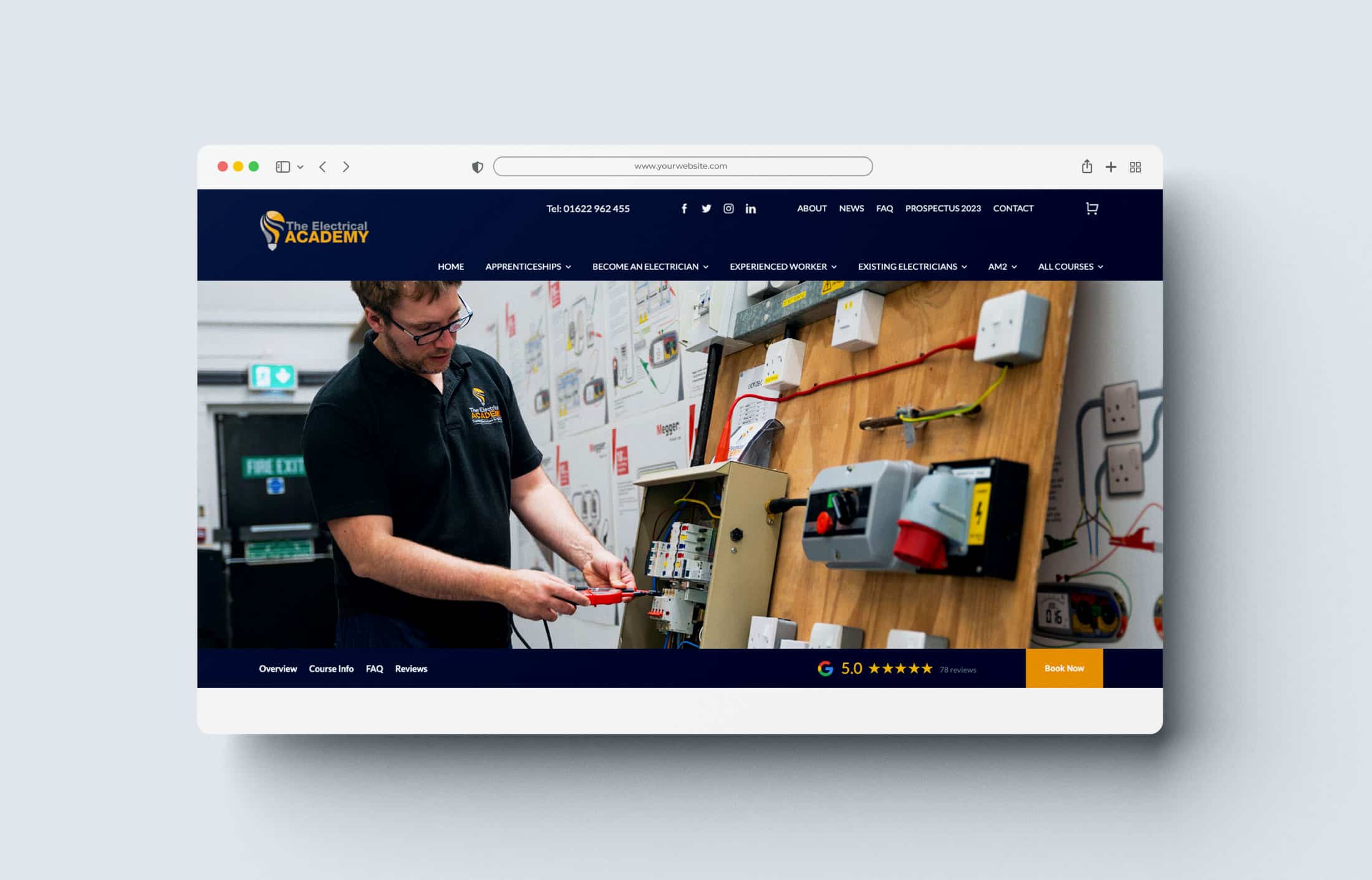
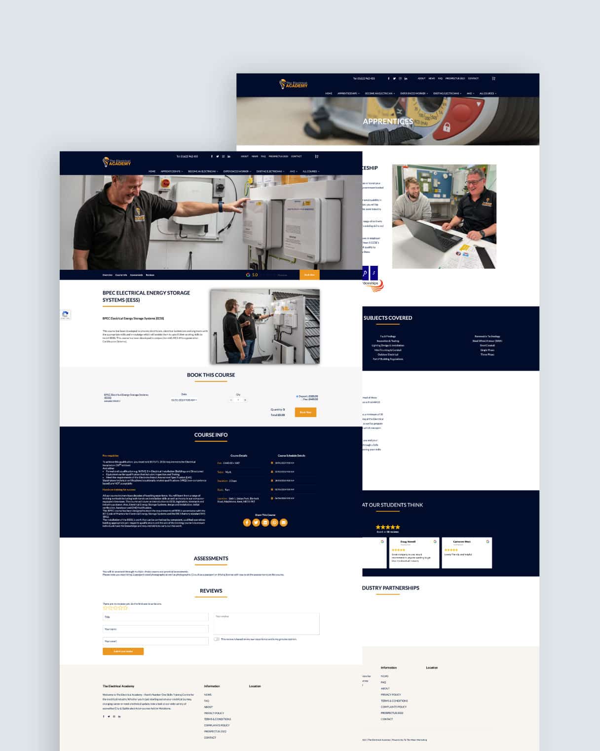
The Electrical Academy instructed Dope Studio to undertake a comprehensive redesign and development project for their website (www.theelectricalacademy.co.uk) with a focus on WordPress integration and the addition of online course booking functionality. The initiative aimed to elevate the user experience, modernise the visual identity, and streamline the process for prospective students to book various electrical courses online.


What we did
We delivered
across all devices.
- Simplified navigation to ensure an intuitive and user-friendly experience
- Optimised the user interface for prospective students to explore courses effortlessly
- Redesigned the website with a fresh, modern look while preserving the academy’s professional image
- Implemented a robust online course booking system
- Ensured secure payment gateways and user-friendly booking processes
The Electrical Academy
marketing assets design
Our mission was clear: to craft print and digital marketing assets that not only showcased the academy’s commitment to excellence but also ensured brand consistency across all platforms.
Brand Identity
High Quality, Professional, and Trustworthy
Our design approach was grounded in the core values of The Electrical Academy – high quality, professionalism, and trustworthiness. We aimed to create visuals that not only appealed to the target audience but also conveyed a sense of reliability and expertise. The challenge was to seamlessly integrate these qualities into the established brand identity while ensuring a cohesive visual language.


Typefase
Lato
Usage
Headlines
A
ABCDEFGHIJKLMNOPQRSTUVWXYZ 0123456789
Instead of utilizing contrast purely for the purpose of mitigating who are excited about unique ideas and help digital companies.
Color palette
| #F0BB74 | ◯ | |
| R 240 G 187 B 116 |
Mellow Apricot
| #BBBBBB | ◯ | |
| R 187 G 187 B 187 |
Grey
| #EB9722 | ◯ | |
| R 235 G 151 B 34 |
Carrot Orange
| #7F7F82 | ◯ | |
| R 127 G 127 B 130 |
Grey
| #111427 | ◯ | |
| R 17 G 20 B 39 |
Eerye Black
Maintaining the main colors of The Electrical Academy’s logo was a fundamental aspect of our strategy. By doing so, we preserved the recognizable and authoritative visual identity that had already been established. Consistency in color not only reinforced brand recognition but also created a sense of harmony across all marketing materials, from print brochures to digital banners.
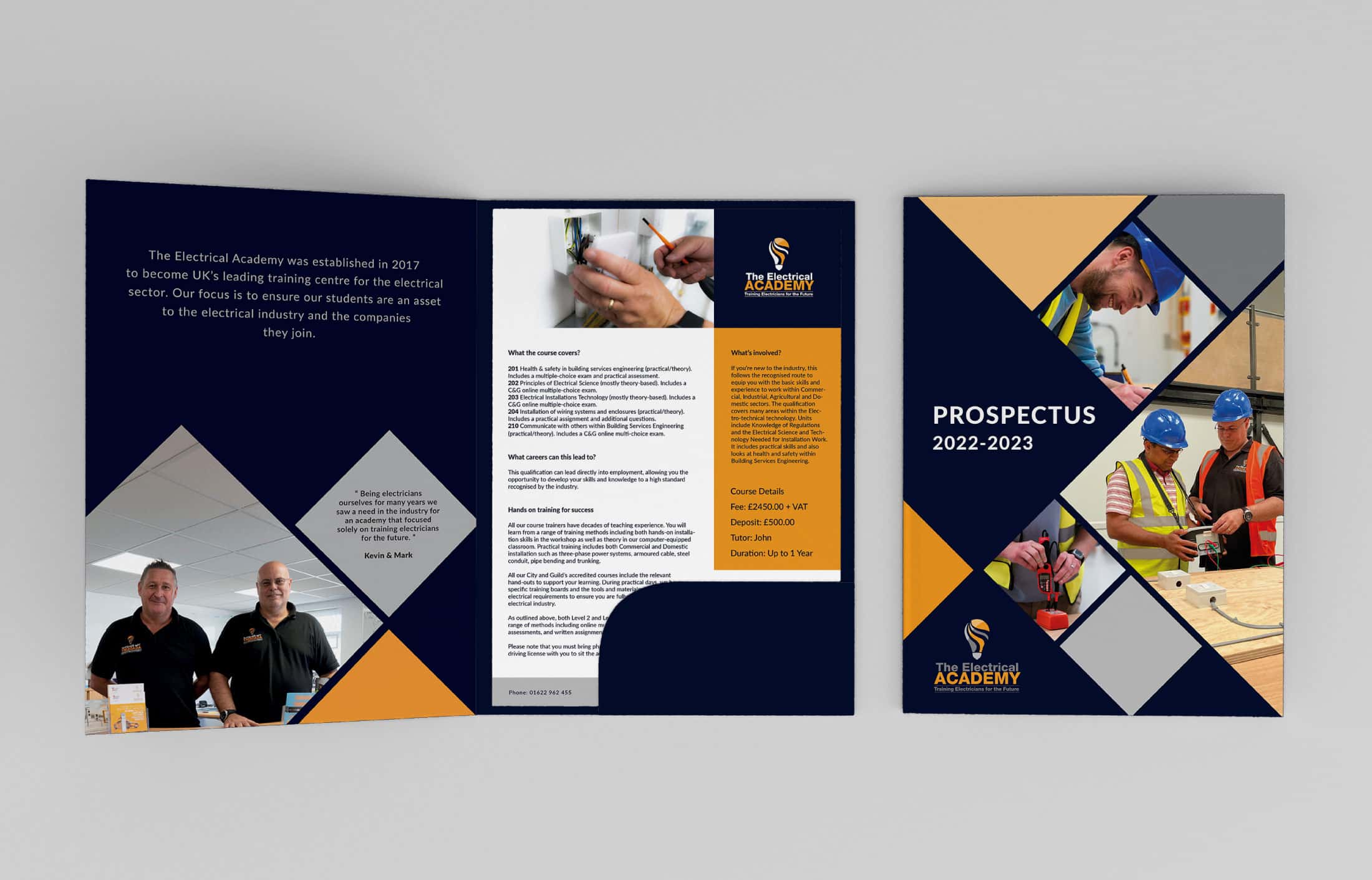
Print materials play a crucial role in conveying professionalism. Dope Studio meticulously designed brochures, flyers, and banners that not only provided essential information but also reflected the high standards upheld by The Electrical Academy. Clean layouts, legible typography, and strategic use of the brand colors ensured that the print materials were not just informative but visually appealing.
LET’S TALK
Need something dope?
Start the ball rolling and get in touch, let’s turn your vision into reality!


